The Windows RT Review
by Vivek Gowri & Anand Lal Shimpi on October 25, 2012 12:00 PM EST- Posted in
- Windows RT
- Operating Systems
- Microsoft
- Mobile
- Windows 8
- Tablets
Internet Explorer 10
There are two distinct versions of Internet Explorer 10 - one that runs in the desktop and looks very similar to the IE9 and IE10 experiences that we’ve been used to on the Windows 7/Windows 8 desktop, and another that runs within the framework of Modern UI and looks like an upscaled version of IE9 Mobile from Windows Phone 7.5 Mango. Both use the same rendering engine and perform identically, so we’ll keep that in mind when looking at performance numbers. Other than the user interfaces, there’s relatively little difference between the two browsers, though you will need to open the desktop IE10 to change browser settings - there's no way to do so from within Modern UI.
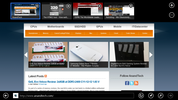
Gestures in the Modern UI version of IE are very important - swiping from the top or bottom brings up the URL bar at the bottom and the thumbnail list of open tabs at the top. It looks great, and keeps the webpage completely clean, but I don’t think the tabbed browsing implementation here is that great - I’d rather see something like Chrome or Safari with the list of open tabs always displayed at the top of the window. Changing tabs requires an extra step (swipe, then select), which isn’t ideal for changing between tabs quickly. If you deal with a lot of open tabs, or have some need to flip between two specific tabs repeatedly, this will get annoying relatively swiftly. It still looks great, and for touch-based browsing it works quite well other than the concerns over tabbed browsing. The “fancy” version of IE10, as Anand called it, strikes me as a very idealistic design philosophy that doesn’t necessarily work as well as a less elegant interface might.
One feature that works very well but could use some performance tuning is the back/forward touch navigation for Modern UI's IE10. To go back a page just swipe from left to right (or right to left to go forward). It's incredibly intuitive. My only complaint? Although going back immediately shows you the previous page, you have to wait for the page to actually re-render before it's usable (which on present day ARM hardware isn't exactly fast). I suspect this is something that will become far more useful over time with faster SoCs.
The desktop IE10 is just desktop IE, you’ve seen this before. Nothing that new, the UI looks pretty similar to IE9 (which is the first version of IE I can remember enjoying, though it will never replace Chrome in my heart) and it functions similarly as well. Obviously, there’s an updated rendering engine, but other than that and a new scrollbar design to match the rest of the Modern UI visual style, there’s not much to see here.

The most interesting part, actually, is in the settings - you can set links to default open in Fancy IE10, the desktop IE10, or let IE decide which to use on a contextual basis. You can also have the IE10 tile in Modern UI to open the desktop IE10, so you can basically ignore the new IE10 UI entirely should you want to do so. Now, I suspect this option exists primarily for desktop and notebook users of Windows 8, who don’t want to deal with using the Fancy IE10 interface with a mouse input. But it’s there for Windows RT users who want to use only the desktop IE10 UI. Personally, I wouldn’t want to use the classic interface in touchscreen devices - UI elements are damn small at this pixel density, making it more difficult to hit the right buttons than it needs to be. There’s a reason the Modern UI variant of IE10 exists.
Performance


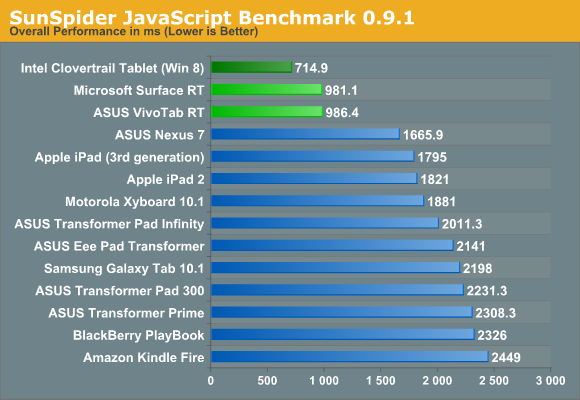
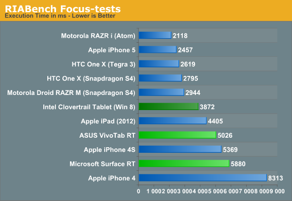
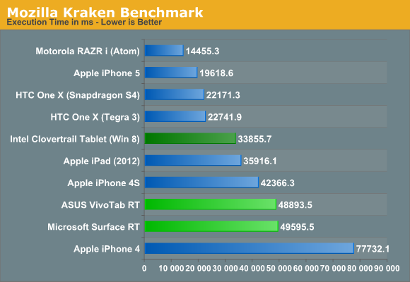
From a performance standpoint, we’ve just brought over the same three benchmarks that were used in the VivoTab RT and Surface RT reviews - SunSpider, RIABench, and Mozilla's Kraken. Honestly, I think SunSpider scores are becoming irrelevant - as one of our commenters said, the art of getting better SunSpider scores has started becoming a race to see who can cheat on the test most. Cheating in this case would be considered optimizing browsers for this specific test, and they’re not wrong. While IE10 has great, great SunSpider scores, it’s far behind in the other two JS benchmarks compared to similar hardware running on other platforms - look at the Surface or VivoTab RT compared to the international Tegra 3 version of the HTC One X. And I’m almost certain that if we had a Nexus 7 on hand to run those tests on, the differences would be larger still.
The HTML5 Test score 320 (plus 6 bonus points) is better than most tablet browsers from a year ago, but lags behind the latest mobile versions of Safari (386+9) and Chrome (390+11). Our Windows 8 Consumer Preview article showed that IE10 had made some pretty significant strides from IE9 (which was leaps and bounds better than 8, and then some) but JS performance is still behind the curve for now. The experience doesn’t suffer from that though - it’s still a very capable modern browser that won’t leave you disappointed.


233 Comments
View All Comments
faizoff - Thursday, October 25, 2012 - link
I just got done fully reading the Surface review. This should be a good one as well.EnzoFX - Thursday, October 25, 2012 - link
Sure was.Win RT is promising, it really is all about the tablet experience. Which is why I don't understand their decision to have the desktop and access to all the underpinnings. Surely a real power user won't limit themseles to RT, and simply go for the 8?
Is it to have developers make desktop-centric arm based apps? That seems counter intuitive. They could have easily made Office into a Modern UI style app. What is the real point in the end? Maybe I missed something.
My only other criticism is little things that sometimes show me lack of focus. 4 edge swipes? Couldn't they have streamlined that down to 2 max? and why must some things just be too hidden, or even not even accessible via the Modern UI?
Leonick - Thursday, October 25, 2012 - link
"Is it to have developers make desktop-centric arm based apps? That seems counter intuitive. They could have easily made Office into a Modern UI style app. What is the real point in the end? Maybe I missed something."Considering developers can't make desktop apps for Windows RT that isnt it...
I'm guessing MS was simply too lazy or "didn't have time" to build a metro equivalent for everything for Windows 8 and will likely continue the work for the next release, as long as the desktop is still there they could also put Office even on RT with minimal effort.
But yea, it's odd.
blanarahul - Thursday, October 25, 2012 - link
I am really interested in seeing Windows RT with Quad Core Qualcomm S4 Pro. 40% faster CPU, 100% faster GPU than Tegra 3. Power friendly. It should make RT shine even more. In fact I believe that the APQ8064 was made for Windows RT.karasaj - Friday, October 26, 2012 - link
This is exactly what I was thinking and hoping Surface would have come out with.Krysto - Thursday, October 25, 2012 - link
"The odds of that situation arising seem relatively low, so my bet is that the strength of the ecosystem will be a non-issue a month from now."Really? A month from now? Can I hold you to that? It will be at least a year before Metro store gets even tens of thousands of apps. I think you've been reading too many Microsoft PR statements ready, and it's starting to influence your objectivity, and now you're just using Microsoft's words as your own - while thinking to yourself that they are your own words.
StevoLincolnite - Thursday, October 25, 2012 - link
Right... Because you're really going to browse and install 10's of thousands of Apps. (With the majority being fart of flashlight apps anyway.)munsie - Thursday, October 25, 2012 - link
So when it was Windows vs Macs back in the 90s, the argument was always that there were more apps on Windows, why would you buy anything else? But now that there are more iOS apps vs Win RT apps, it's that most of them are "fart of flashflight apps"?More apps isn't just more junky apps -- it means that more experimentation/innovation is happening as well. It means that there are apps being built for the long tail, not just the mass market appeal. Think about apps targeting very specific users, like doctors, lawyers, engineers, etc. These apps aren't the ones you see at the top of the charts, but are the ones that sell platforms.
Microsoft more than any other company should understand what Apple has accomplished with the iOS App Store.
andrewaggb - Thursday, October 25, 2012 - link
Yes and no though. Developer tools are much better than they were in the 90's.Many of these apps are already cross platform with ios and andriod, and many others already have windows versions or silverlight/wp8/xbox 360 versions that can be ported much easier.
Many of the popular dev tools used by smaller/indie developers already support exporting to different platforms, so if they don't support windows 8 yet, they will soon enough.
Plus Visual Studio is great.
Not to say Apple's accomplishments aren't amazing, they are. Nobody could have envisioned the success they've had in such a short time.
Apps will come. There's no money to be made right now anyways, nobody has devices, it'll all sort itself out in a few months. I think 1 month is optimistic, but within 6 months the apps will be there.
StormyParis - Thursday, October 25, 2012 - link
Well, the 90's argument was "1- why pay more 2- for slower, less expandable hardware that 3- is missing some key apps or even whole categories of apps and 4- is fading", so really, a series of issues.In the present case we get , 1- why pay the same or less 2- for slower, but a lot more expendable hardware that 3- has a killer app, though it's missing many key apps and all of the non-key ones but 4- will probably surge.
BTW... Google "75% Of Apple's App Store Is Ignored by Consumers" for a fun fact, if it is indeed true.